


Originally posted by: DevilHere
Bugs :
I see the teams pill even on non IPL related forum and clicking it takes me to the user already logged in click here to be redirected page
The settings/option wheel at the top right of the forum page that was earlier showing show signature option has no option anymore
On clicking any button or hyperlinks there's a blue flash box around it
The webpage loads real slow. After logging in you're on the click here to redirected page for 5-6 secs before redirecting you and mostly end of using the click here button. Not the most pleasant UX
Clicking on message notification user icon in the top header all three menus open up together those should only be visible one at a time
Suggestion:
The forum hyperlink on top of each page is not bold at all has no hover property and therefore seems like a ordinary text and not a clickable hyperlink
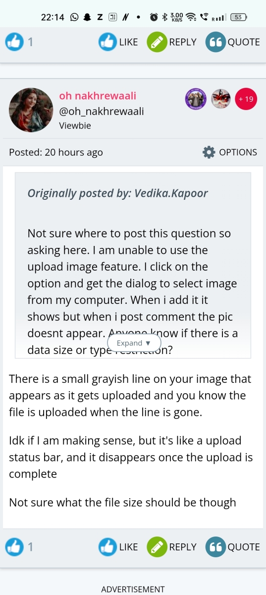
For the nth time the expand UX :
The expand button comes over the text take this for eg
And when I press the expand button there's no more extra text .We should not have expand button in that case .
Can we not have similar implementation like with the page info modal a small button to the side with expand collapse both functionality
Or twitter show more hyperlink implementation
Reddit and Instagram click on the box to expand or collapse these would be much cleaner UX
Answering them individually.
I see the teams pill even on non IPL related forum and clicking it takes me to the user already logged in click here to be redirected page
Yes we would get this fixed.
The settings/option wheel at the top right of the forum page that was earlier showing show signature option has no option anymore
We do have this option forum post page. The page which is showing just the topics list do not. We can add the option there also.
On clicking any button or hyperlinks there's a blue flash box around it
Can you share some screenshot so that we can understand the issue better.
The webpage loads real slow. After logging in you're on the click here to redirected page for 5-6 secs before redirecting you and mostly end of using the click here button. Not the most pleasant UX
It is set that way by design as it is to ensure that login javascript runs on the page (different devices). We would see if we can have a countdown kind of thing so that it's easier.
And when I press the expand button there's no more extra text .We should not have expand button in that case .
That is based on the quote box height and in some cases that might happen even if it's little more.
Or twitter show more hyperlink implementation
Reddit and Instagram click on the box to expand or collapse these would be much cleaner UX
We would look into this.


comment:
p_commentcount