


Posted:
thank you for clarifying dear Vijay .
That button has reappeared for me in the PM chain
Here are the two SS taken today .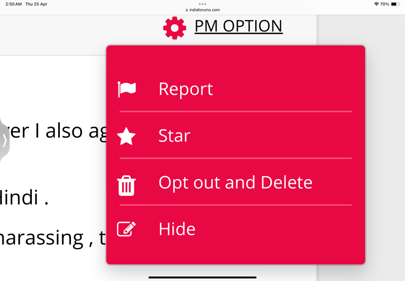
The earlier one for comparison .
Thanks
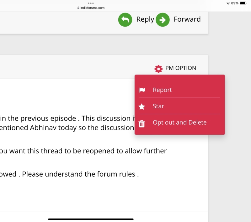
thank you for clarifying dear Vijay .
That button has reappeared for me in the PM chain
Here are the two SS taken today .
The earlier one for comparison .
Thanks
Thankfully I’ve not faced any issues so far but will definitely report if I do
Are you facing any of these issues? Please share screenshot as it helps us understand the issue easily.

I’m using an safari on an iPhone 12
Can you share which device / browser you are using so that we can replicate the issue and debug it.
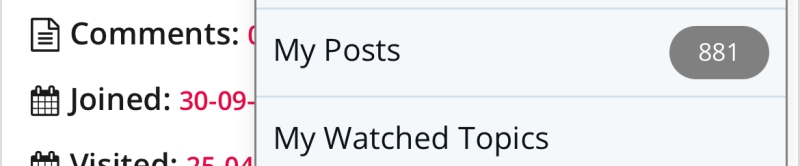
How to check our siggie? There was a option previously in every page now I can't see it
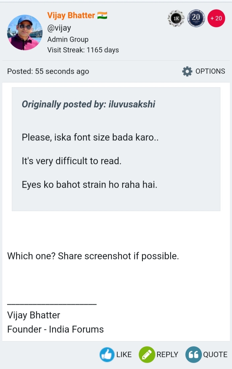
Please, iska font size bada karo..
It's very difficult to read.
Eyes ko bahot strain ho raha hai.
Originally posted by: iluvusakshi
Please, iska font size bada karo..
It's very difficult to read.
Eyes ko bahot strain ho raha hai.


The header still disappears while scrolling down. Comes back scrolling up.
The dropdown in new layout doesn’t have some outline around posts number to differentiate
The new one also has more grey gradient like the quote box which you improved. If you could give a look at this as well
New

Old - which I can access from my profile page
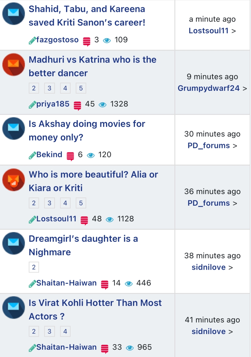
I will try and make this request once more. The old layout for main page posts was easy on the eyes. maybe because it was elongated, had more white space, different colour scheme. The new one feels so cramped and tiny I cannot read the titles on the main page without feeling strained. The green pencil also overlapping with usernames. If there could even be a minor improvement it will be great
Old
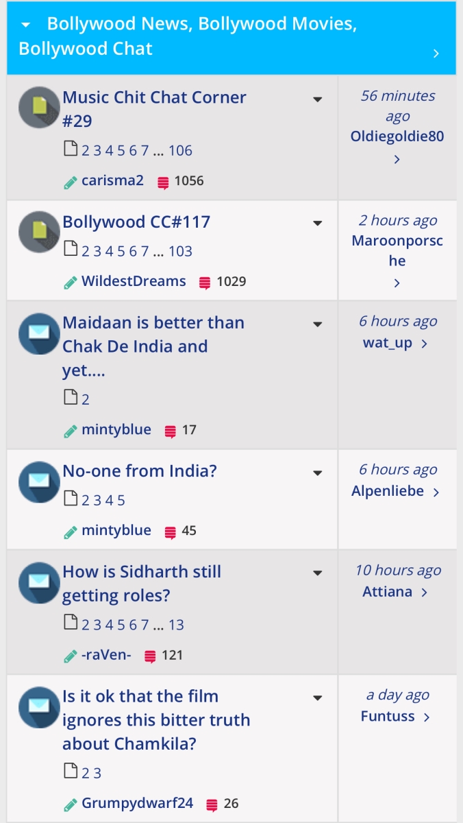
New
| topics | author | replies | views | reply |
|---|---|---|---|---|
| carisma2 | 22 | 1379 | ||
| vijay | 1209 | 92645 | ||
| Sutapasima | 92 | 9557 |


comment:
p_commentcount