Deewani Type Girls #7 (Invites Only) - Page 3

Created

Last reply

Replies

766

Views

17.4k

Users

2

Likes

753

Frequent Posters

Sumaiya27 thumbnail
Anniversary 13 Thumbnail Visit Streak 90 0 Thumbnail + 4
Posted: 1 years ago
#21

Originally posted by: m4manju

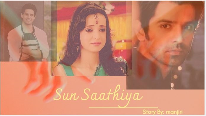
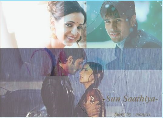
Tried my hand at a banner again. It's for a story where khushi's ex-husband(played by Sid malhotra) is dead and she is not ready to move on, until Arnav's love starts affecting her. Pls tell me honest feedback on banner #1 and #2 😳


#1

SunSathiya1.JPG


#2

SunSathiya2.JPG


wow, first of all, i love both banners 👏i'm so proud of my rockstar


now since i like both, i would suggest choosing one that suits your story best. so here are my opinions about each:

  1. it shows arnav has more importance in khushi's life and her ex husband is a small part of the story. so use this if sid is only mentioned as a set up and isn't that big part of khushi's life in the story (just like in katha ankahee where katha's ex husband adi who had passed away few years ago. he is only shown in flashbacks and only through katha's pov. the story focuses only on kathan and viaan, not on adi, adi is just a part of katha's backstory)
  2. this one shows khushi's bond with both sid and arnav. it shows she was very happy with sid (i also appreciate how khushi looks married in the top photo) and he was a very important part of her life as well as the story. and the bottom shows arnav is also an important part of her life and she wasn't immediately happy with him like she's shown to be with sid. i also think this banner incites a curiosity in the reader because they want to know why khushi is paired with two guys and whom will she end up with (which they wont know until they actually read the story)


hope that was clear, i just wrote the first thoughts that came to my mind after seeing the banners 🤗

Sumaiya27 thumbnail
Anniversary 13 Thumbnail Visit Streak 90 0 Thumbnail + 4
Posted: 1 years ago
#22

Originally posted by: m4manju

Where are you gayab the whole day today? missed you 😒


yaar i'm so sorry, turns out my weekends are busier than the weekdays. although i didn't have much planned, ended up having to go out both days and i was really exhausted by the end of the day so couldn't log in to IF. also had errands to run and laundry to do


anyway, how was your weekend? hope you had time to relax 🤗

m4manju thumbnail
Anniversary 14 Thumbnail Micro Phobia Contest Participant 0 Thumbnail + 7
Posted: 1 years ago
#23

Originally posted by: Sumaiya27


wow, first of all, i love both banners 👏i'm so proud of my rockstar


now since i like both, i would suggest choosing one that suits your story best. so here are my opinions about each:

  1. it shows arnav has more importance in khushi's life and her ex husband is a small part of the story. so use this if sid is only mentioned as a set up and isn't that big part of khushi's life in the story (just like in katha ankahee where katha's ex husband adi who had passed away few years ago. he is only shown in flashbacks and only through katha's pov. the story focuses only on kathan and viaan, not on adi, adi is just a part of katha's backstory)
  2. this one shows khushi's bond with both sid and arnav. it shows she was very happy with sid (i also appreciate how khushi looks married in the top photo) and he was a very important part of her life as well as the story. and the bottom shows arnav is also an important part of her life and she wasn't immediately happy with him like she's shown to be with sid. i also think this banner incites a curiosity in the reader because they want to know why khushi is paired with two guys and whom will she end up with (which they wont know until they actually read the story)


hope that was clear, i just wrote the first thoughts that came to my mind after seeing the banners 🤗

This is such an awesome, super-duper useful feedback, sumya! I love you! 🤗

Thanks for taking time to write in details about what you liked with both banners and what sort of message they present! I love how you tried to decode a story through the banner. Also, I understand the comparisons with katha 👍🏼


I will go with banner #2 then, as sid is gong to make a comeback from dead 😛


Also, no changes in color or placement of pics needed right?

m4manju thumbnail
Anniversary 14 Thumbnail Micro Phobia Contest Participant 0 Thumbnail + 7
Posted: 1 years ago
#24

Originally posted by: Sumaiya27


yaar i'm so sorry, turns out my weekends are busier than the weekdays. although i didn't have much planned, ended up having to go out both days and i was really exhausted by the end of the day so couldn't log in to IF. also had errands to run and laundry to do


anyway, how was your weekend? hope you had time to relax 🤗

I totally understand! Weekends are becoming busier for you, I know. But also, I missed you so much over the weekend 😔


I had a relax weekend overall. met friends, rested and did some house cleaning and stuff.

Sumaiya27 thumbnail
Anniversary 13 Thumbnail Visit Streak 90 0 Thumbnail + 4
Posted: 1 years ago
#25

Originally posted by: m4manju

This is such an awesome, super-duper useful feedback, sumya! I love you! 🤗

Thanks for taking time to write in details about what you liked with both banners and what sort of message they present! I love how you tried to decode a story through the banner. Also, I understand the comparisons with katha 👍🏼


I will go with banner #2 then, as sid is gong to make a comeback from dead 😛


Also, no changes in color or placement of pics needed right?


Aww i you love too 🤗 ❤️ thank YOU for giving me a sneak peak into your banners 😎


great choice considering that he'll be back!


photo placement is perfect, i would just say make the colours darker/increase the contrast a bit? other than that, the banner is perfect just like all your other work 👏

Sumaiya27 thumbnail
Anniversary 13 Thumbnail Visit Streak 90 0 Thumbnail + 4
Posted: 1 years ago
#26

Originally posted by: m4manju

I totally understand! Weekends are becoming busier for you, I know. But also, I missed you so much over the weekend 😔


I had a relax weekend overall. met friends, rested and did some house cleaning and stuff.


aww i'm so happy to know that you had a relaxing weekend!


and thank you so much for understanding, i really appreciate it 🤗


btw is it just me or did the last week and weekend go by really fast? i just realized that it's already been a week since i had my conference presentation (march 13th) 😲 also march as a month is also flying by! not that i'm complaining because you know why 😆

m4manju thumbnail
Anniversary 14 Thumbnail Micro Phobia Contest Participant 0 Thumbnail + 7
Posted: 1 years ago
#27

Originally posted by: Sumaiya27


Aww i you love too 🤗 ❤️ thank YOU for giving me a sneak peak into your banners 😎


great choice considering that he'll be back!


photo placement is perfect, i would just say make the colours darker/increase the contrast a bit? other than that, the banner is perfect just like all your other work 👏

You are so sweet 😳


@photo placement and colors- noted. I'll adjust the coloring and contrast before using it. Thanks for the suggestions, and encouragement 🤗

m4manju thumbnail
Anniversary 14 Thumbnail Micro Phobia Contest Participant 0 Thumbnail + 7
Posted: 1 years ago
#28

Originally posted by: Sumaiya27


aww i'm so happy to know that you had a relaxing weekend!


and thank you so much for understanding, i really appreciate it 🤗


btw is it just me or did the last week and weekend go by really fast? i just realized that it's already been a week since i had my conference presentation (march 13th) 😲 also march as a month is also flying by! not that i'm complaining because you know why 😆

hehe no, it's not just you, time is indeed flying superfast! And I know very well who's the most happy at this 😆

Sumaiya27 thumbnail
Anniversary 13 Thumbnail Visit Streak 90 0 Thumbnail + 4
Posted: 1 years ago
#29

Originally posted by: m4manju

You are so sweet 😳


@photo placement and colors- noted. I'll adjust the coloring and contrast before using it. Thanks for the suggestions, and encouragement 🤗


girl YOU are the sweetest 🤗

Sumaiya27 thumbnail
Anniversary 13 Thumbnail Visit Streak 90 0 Thumbnail + 4
Posted: 1 years ago
#30

Originally posted by: m4manju

hehe no, it's not just you, time is indeed flying superfast! And I know very well who's the most happy at this 😆


ahhaahahha you got it 😆

Top