


Hello team, congratulations on testing the new UI.
I encountered a few issues after the new UI update -
1. When clicking on the notification for tag, previously it redirected to the post I am tagged. Now it's stopping on the first post on the page. We need to scroll to find the post thus eliminating the basic purpose of tag/dm/ notification. **SEEMS TO BE FIXED**
**This is crucial as if I am tagging someone or am being tagged on the very bottom of the page, I might scroll past it. Positive that it will be fixed with caching.
2. Similarly to tagged posts, when I am clicking notification for XYZ has liked my post, it again stops on the top of the page (doesn't redirect to the post the member has liked) ✅ *** FIXED ***
3. Same with inbox hyperlinks. I have to scroll to find the post even though the sender has linked the specific hyperlink. **SEEMS TO BE FIXED**
4. Loading time has increased subsequently.
5. Too many distractions.
6. The differentiating colors are either too contrasting or non-existent. Example - read or unread PMs/Notification
7. The reading area(body) has been narrowed down to an excessive level. While there is too much empty space on the right side. (from desktop)
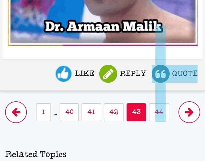
8. Clickable contents showing Typing Cursor ( | ) instead of Mouse cursor ➤
9. Logout option is not visible under forums, have to go to my posts in order to view logout.
10.
Needless to say, the UI looks quite outdated and claustrophobic. The neatness is gone. If possible kindly revert back to the previous clean interface while keeping the useful changes🙏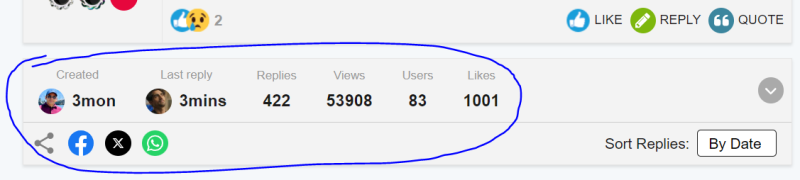
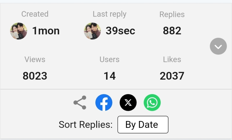
This top info part in the middle of every page is an overkill. On the very first page of the thread is sufficient IMO. Or kindly move it to the bottom where this doesn't break the flow/act like a distraction.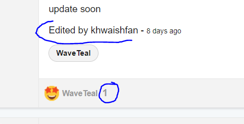
The 'edited by' is hideously big, needs rescaling. ✅*** FIXED ***
The part where only one person has liked, no point of indicating the number "1" - if it's a glitch hopefully gets removed.
The features which are useful so far is the new sorting by dates and likes.
And the "expand" option for quotes - loved it for long quotes. BUT - Needs a limit of 5 lines minimum to get the expand option to work. Otherwise just extra clicks and inconvenience for shorter posts.
For now, noticed these. Might update if I encounter more bugs/issues.
Regards. 🌸


comment:
p_commentcount